Naz Real Estate
Brand Identity · Print Design
Nazanine Koohi is an attentive and compassionate real estate agent. Naz’s top priority is to understand and honour the unique circumstances, needs, desires, and concerns of her clients.
Discovery & Branding Workshop
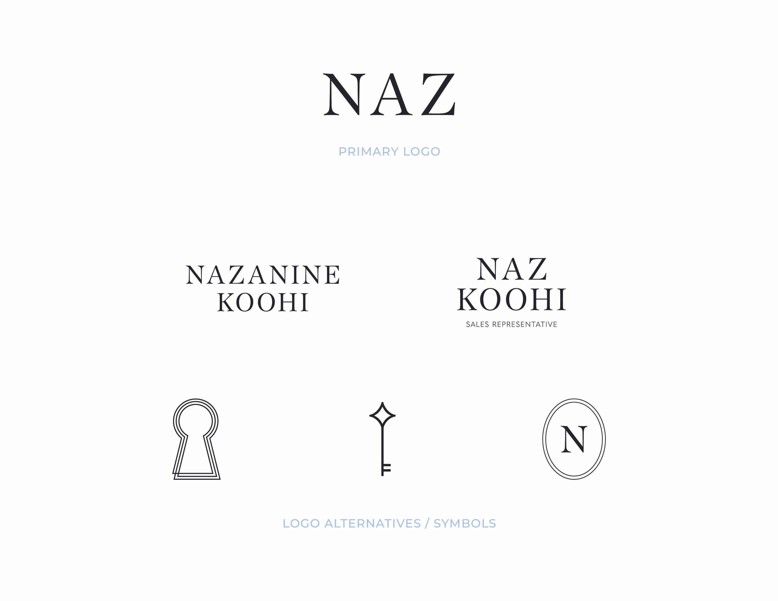
Naz wanted a simple, elegant, and “feminine” aesthetic for her new branding. She preferred to go by “Naz”, but also wanted some alternate logos with her full name. Naz loved the font of Aritzia and came to us with that logo as her main inspiration. Beginning with an initial brand concept, Naz loved it but wanted the addition of a key as an illustrative asset in her branding. This was the first and only revision, before the final product was designed.
Branding Results & Implementation
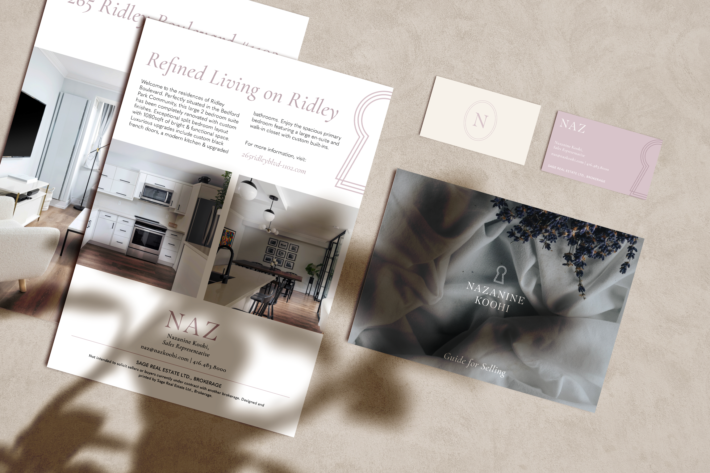
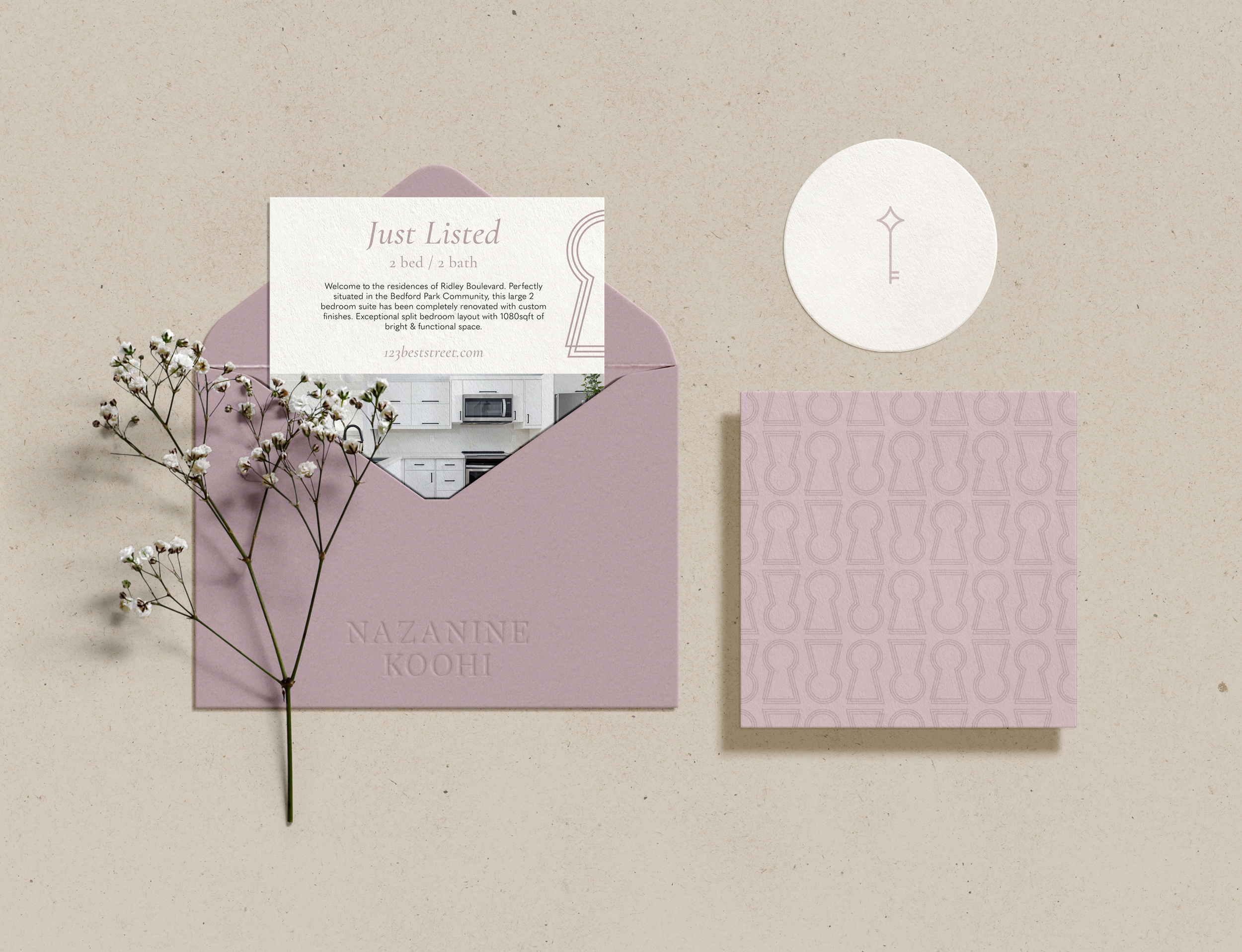
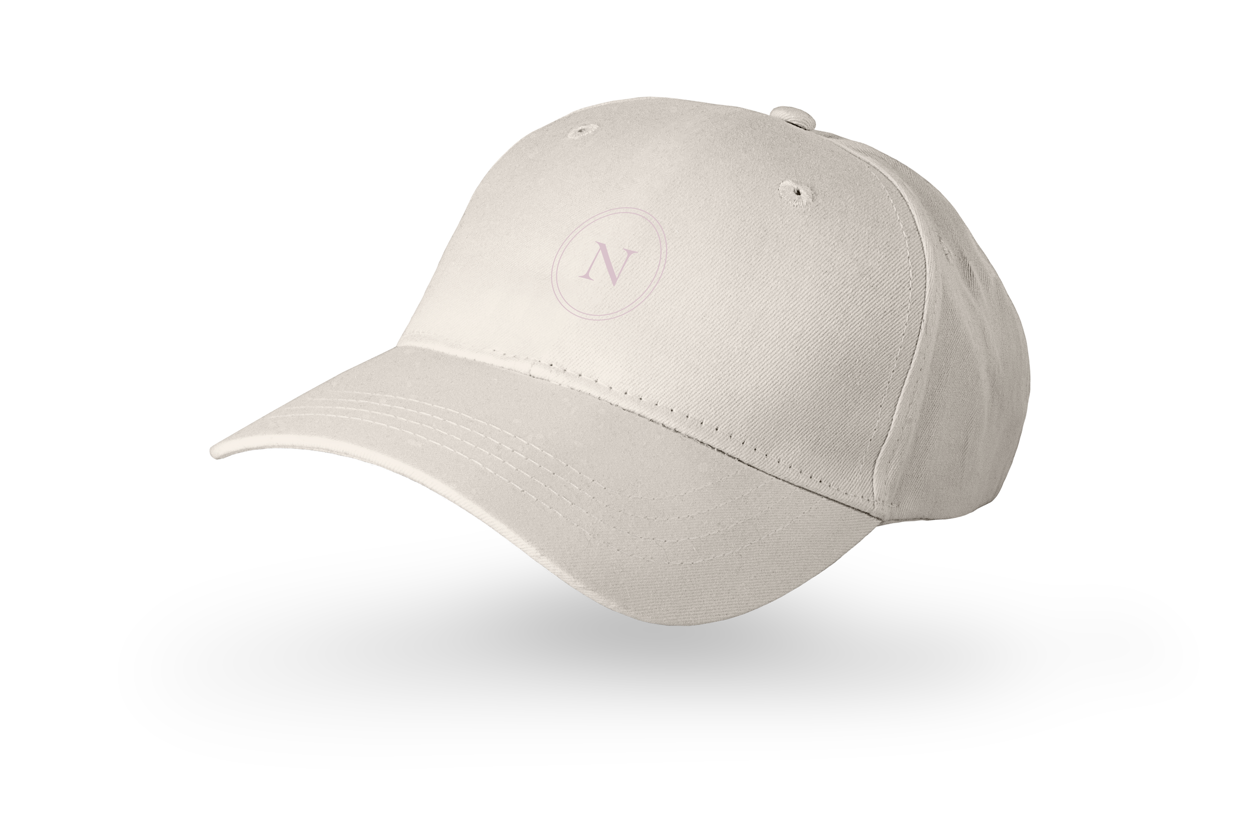
The final full brand package consisted of a primary logo, logo alternatives, and two symbols were designed to represent a new successful buyer. A simple colour palette with a light and dark muted mauve were crafted to reflect an elegant, modern, and “feminine” branding. A sophisicated serif font was used to design the logo, and used in the font package as the headings. Beautiful and cohesive branded print collateral were then designed to showcase how the brand will be used.